
The Principles of Design: Contrast
Why Rooms Without Contrast Feel Flat
A room can be beautiful, neutral, and well furnished — and still feel dull. When that happens, the issue is rarely the color palette. It’s usually a lack of contrast.
Contrast is what gives a space depth, clarity, and energy. Without it, even the most thoughtfully designed rooms can feel one-dimensional.
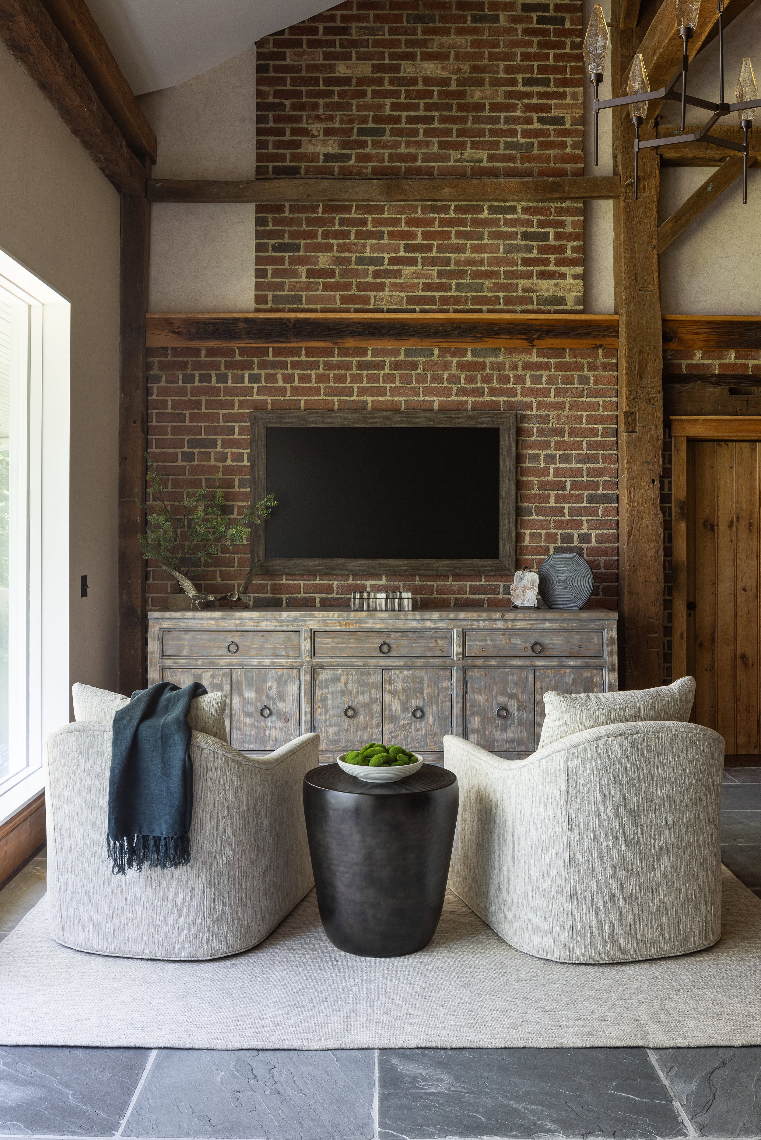
The brick wall was stark when we started. We added texture to the walls and a large wood console to calm the contrast.
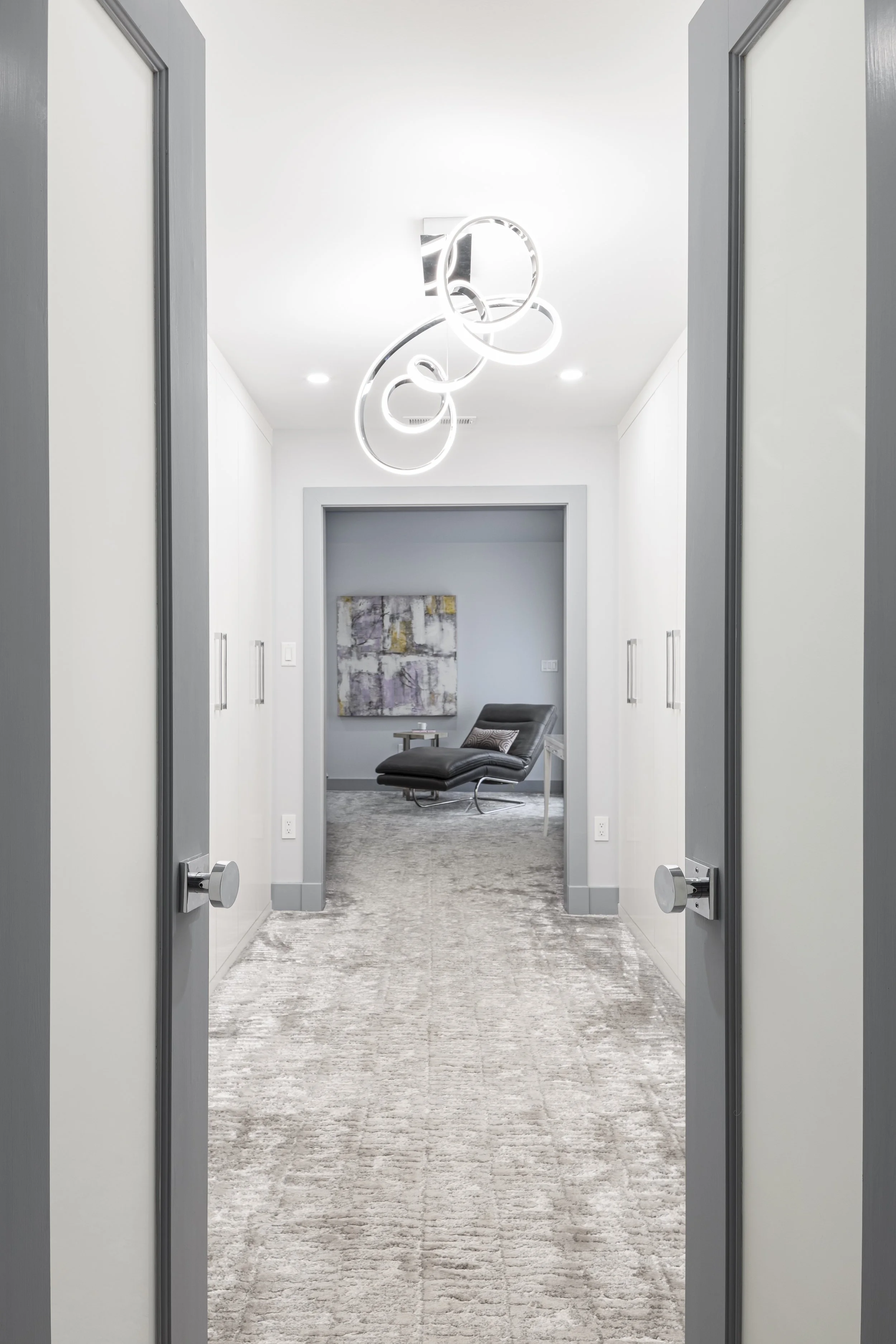
Fuzzy soft carpet is an ideal contrast to the glossy closet cabinets.
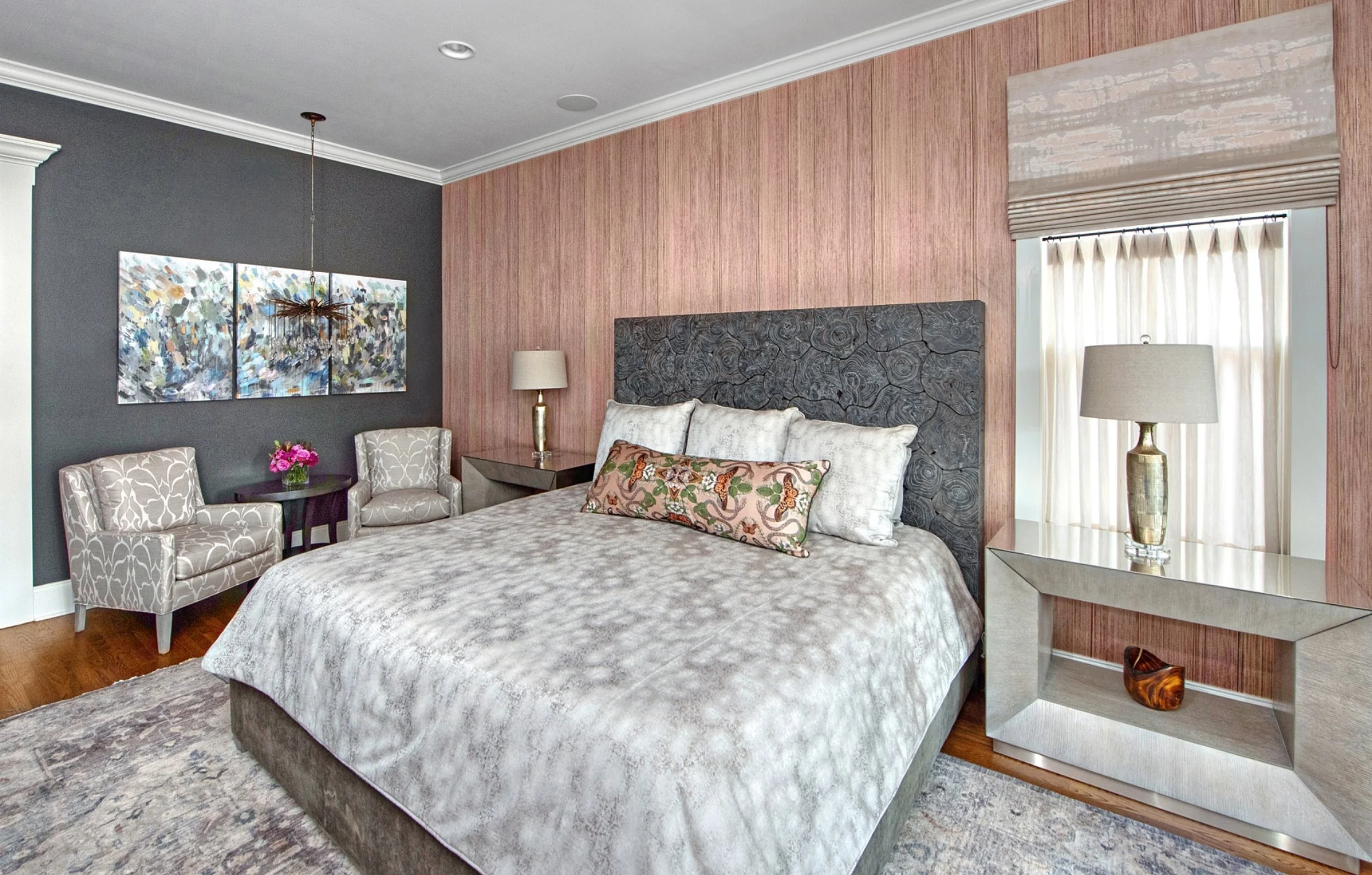
Gratuitous accent walls that stand out too much are a mistake. We balanced this richly textured silk with a deep brown to unite it with the colors in the headboard.
Too little contrast makes a room boring. Too much makes it chaotic.
Knowing how to strike the right balance — and where contrast will have the most impact — is what separates thoughtful design from decoration. It’s also why designers can create depth without relying on trends or loud color choices.
When contrast is done well, a room feels layered, confident, and timeless.
That balance brings us to our next principle: Unity and Variety — the delicate relationship between consistency and contrast. How do you create interest without losing harmony? How do you layer personality without sacrificing flow?
We’ll explore exactly that in our next post.
If you’re enjoying this series and finding yourself looking at your home with a more discerning eye, we’d love to continue the conversation. And if you’re ready for a space that feels layered, intentional, and beautifully cohesive, contact us— we’re here to help you bring it all together.