warm up your gray
The gray trend started back around 2008 and after 14 years it has finally played out. Are you ready to move on from the grays? Stay tuned for my warm neutral recommendations.
While gray was all the rage, I did not allow my clients to go cold grey. I had my go-to colors that would be there for them when the pendulum started to swing. I still believe in these.
My Favorite Shades of Gray
Agreeable Grey

In 2016 Agreeable Grey was the #1 selling paint color at Sherwin Williams. Although grey is in the name, I would be hard-pressed to call it cold.
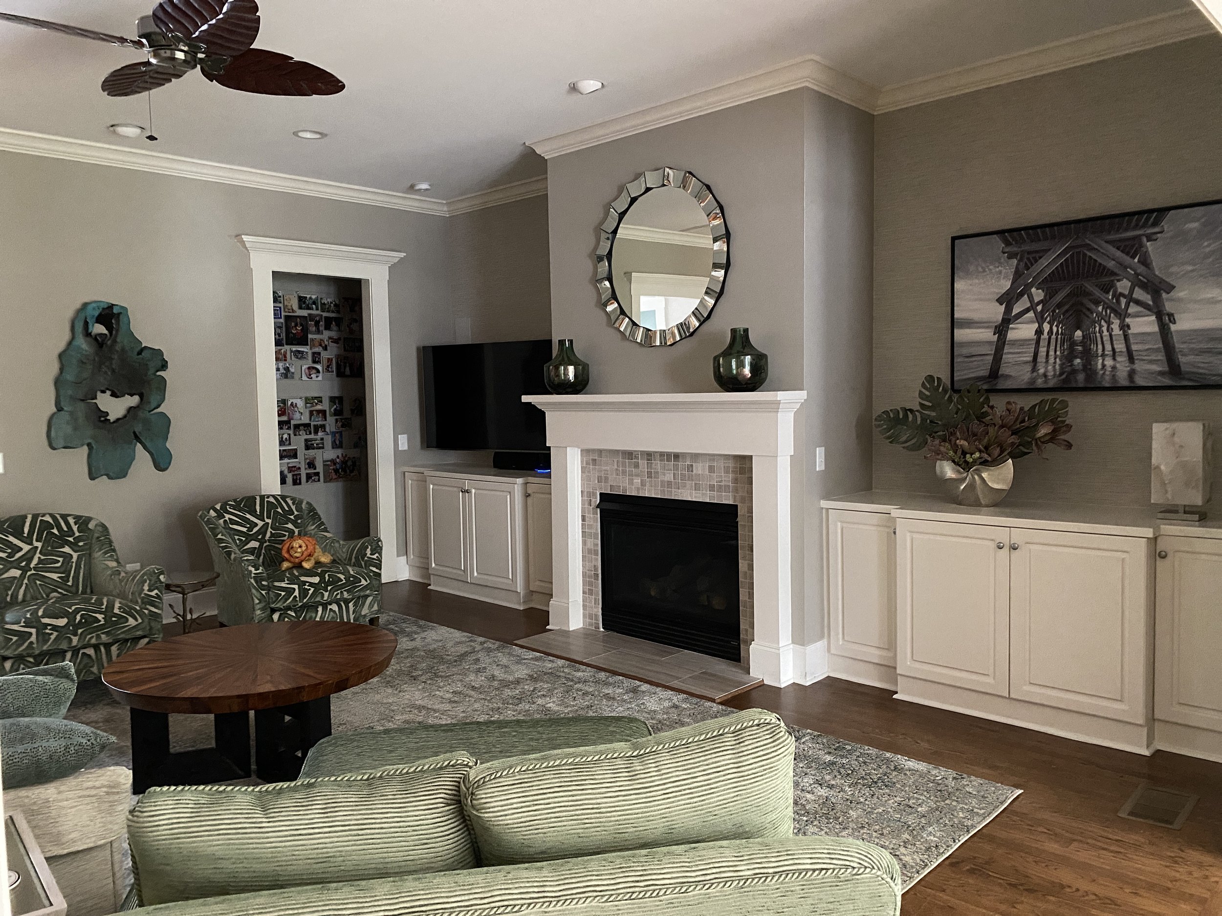
Perfect Greige

Perfect Greige is even warmer than Agreeable grey and was a great gray paint background for the new stone fireplace.
Worldly Grey

Again that word is in the color name, but Worldly Grey really is a warm tone.
To help the warming trend Stacy Garcia gave these accent tips in her recent trend forecast at Neocon last summer:
Stacy says: An almost black charcoal will anchor the old and the new
Olympus White

This is one of the cool grays. I like it because it leans blue. We did the island in Sea Serpent—these inky charcoal blues actually warm up the room.
Stacy says: mineral or olive green—an earthy green will bridge the warm and cool tones
My favorite Worldly Grey
This earthy gray tone is a perfect backdrop for the neutrals and greens in this room. It creates an earthy, calming vibe.
Stacy says: try slate blue—similar idea to using charcoal to anchor the grey
Agreeable Grey with Blue

Our built-ins with a wallpaper accent do the trick here picking up the gray and pulling the room together while creating modern eye-catching appeal.
Accents for Gray
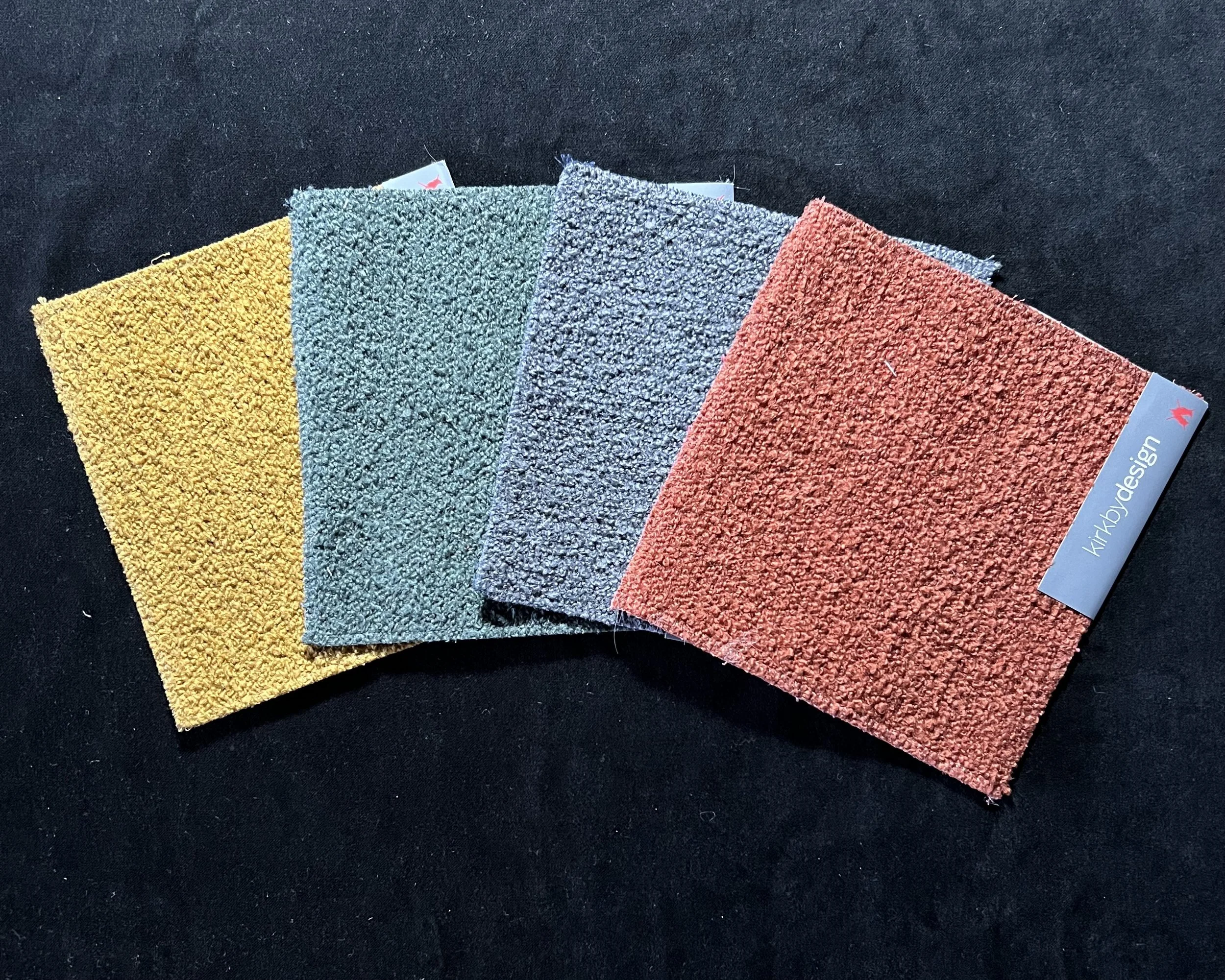
Look for accent colors like these to warm up your grays. Bright tones like these are perfect for throw pillows, window treatments, accent walls or anywhere you want to add a pop.
I do not recommend going all in on the warmer neutrals unless other fixed items in your home call for it (flooring, cabinetry, etc).
Malabar

This is a great neutral that works in homes with warm wood tones and natural stone fireplaces. It does not read yellow or orange, which most of us are ok avoiding. As you can see, it actually provides a nice warm contrast to the red accent tones.
Everlasting

This is another good blend color when your home features traditional warm tones. Here it doesn’t contrast with the wood, instead, it provides a lighter canvas for the rich tones to stand out. Then the black banister provides visual contrast and pulls the design together.
Compare and Contrast the Gray Paint Swatches
These are the warm gray paint colors shown in the first six photos. Clockwise starting at the top, top to bottom with the lighter color named first (all Sherwin Williams): Agreeable Gray 7029 & Anew Gray 7030; Popular Gray 6071 & Versatile Gray 6072; Olympus White 6253 with accent Sea Serpent 7615; Worldly Gray 7043 & Amazing Gray 7044.
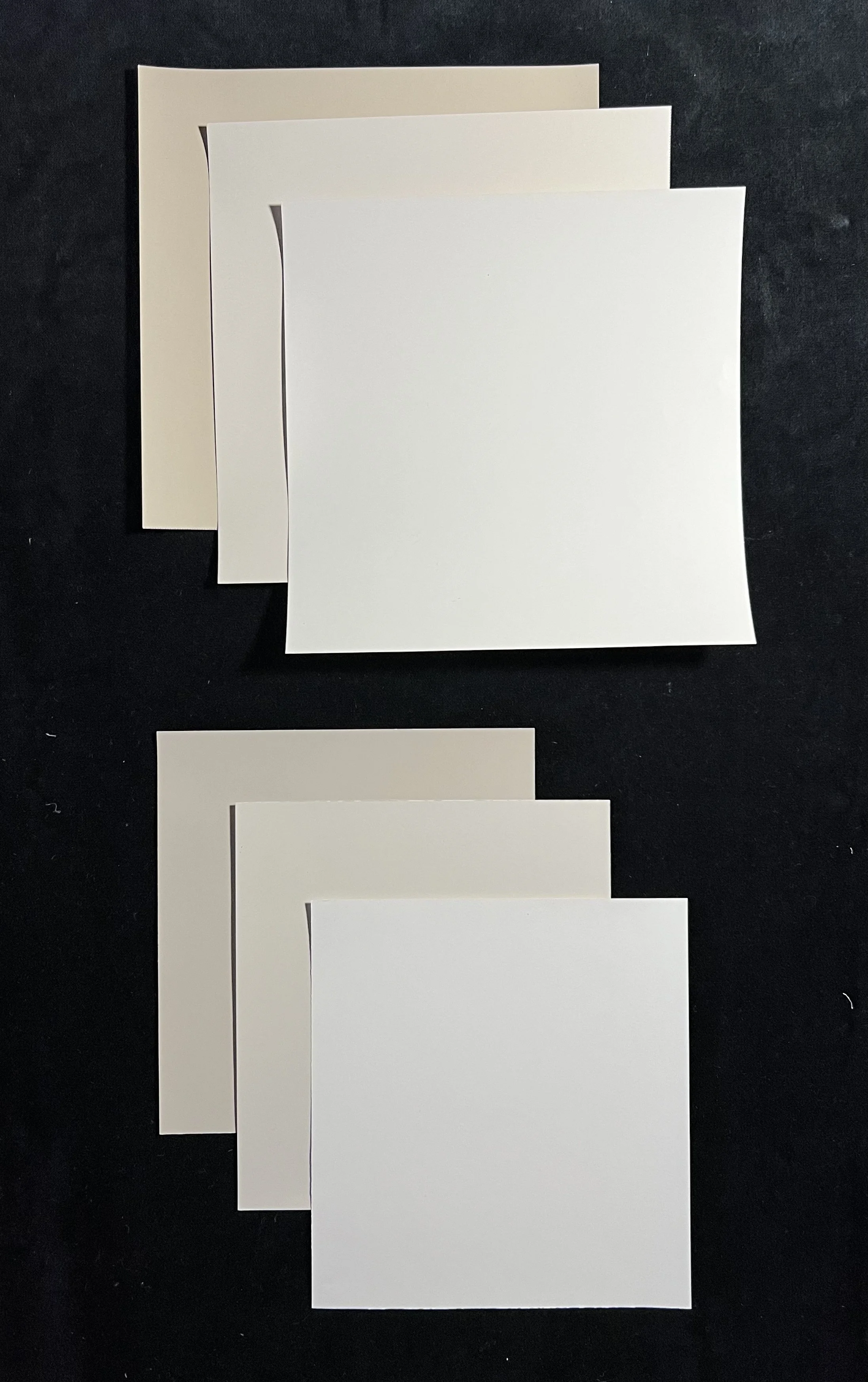
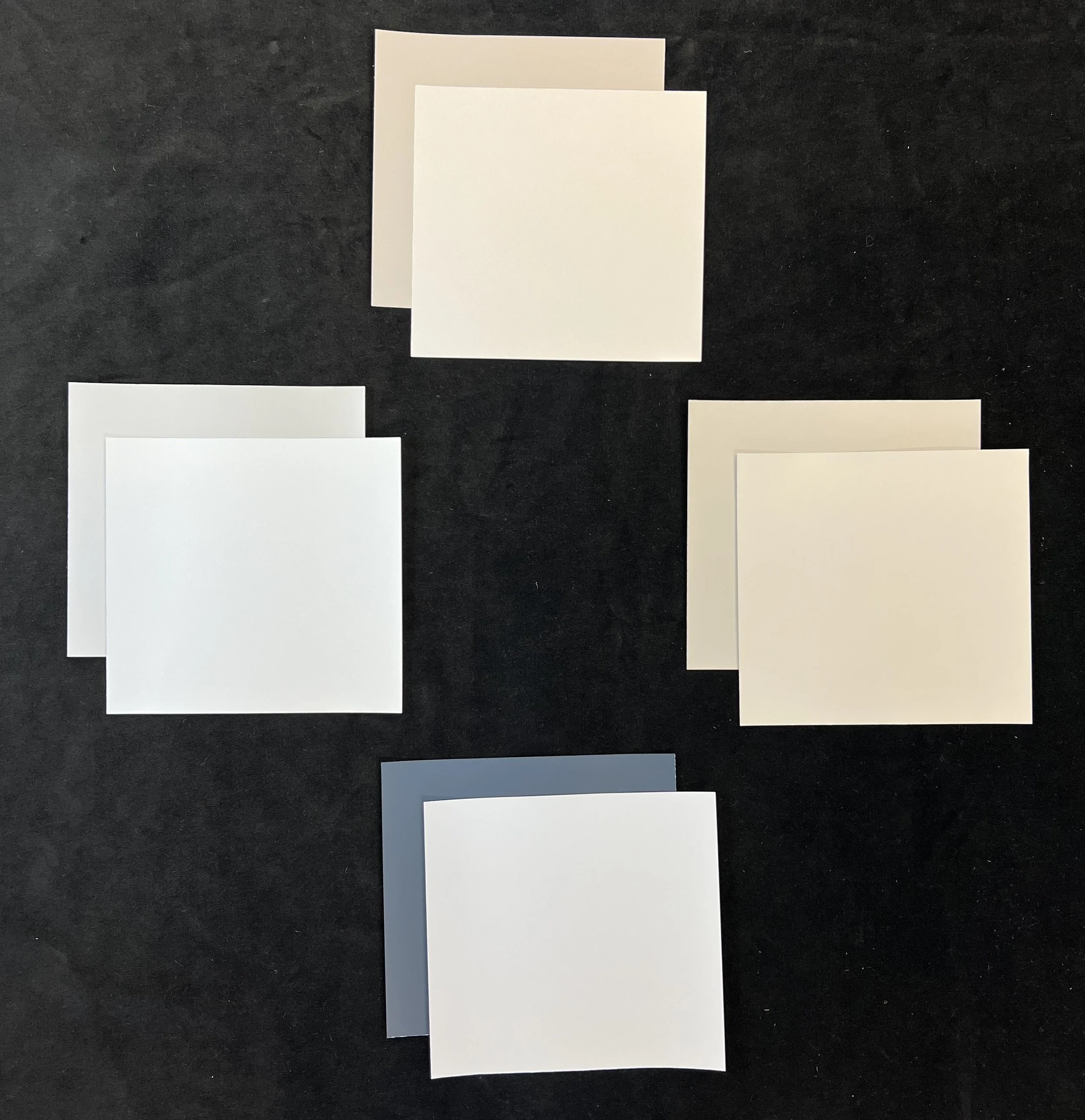
These are the warmer neutral gray paints, top to bottom, and lighter shades named first: Benjamin Moore Muslin 1037, Everlasting 1038 & Stone House 1039; Sherwin Williams Natural Linen 9109, Malabar 9110 & Antler Velvet 9111.
Feeling like you’re lost in 50 shades of gray? Contact us to find the perfect shade for your place.