
Vibrant visions: 10 paint colors that are perfect for your home
Choosing a color can be a challenge. Consider these questions as you start your quest.
Should you go bold or go safe?
What about the emotions that colors evoke? Should you start there?
Think about your travels and what places made you feel a certain way. Colors can be reminiscent of places we have been.
Are you accenting or blending?
These are some of our favorite paint colors and how we have used them.
Sea Salt


Sea Salt by Sherwin-Williams is a versatile color that can be an excellent choice for various rooms in your home. We used it in this bedroom to foster a calming environment, promoting restful sleep and relaxation. In living areas, it brings the outdoors in, infusing the space with a refreshing and revitalizing energy.
2. Iron Ore

This dark grey has a remarkable ability to create a dramatic impact and enhance the vibrancy of surrounding elements. Iron Ore by Sherwin-Williams can complement a wide range of design styles. It serves as an excellent backdrop for both modern and traditional aesthetics, adapting effortlessly to various color schemes and textures.
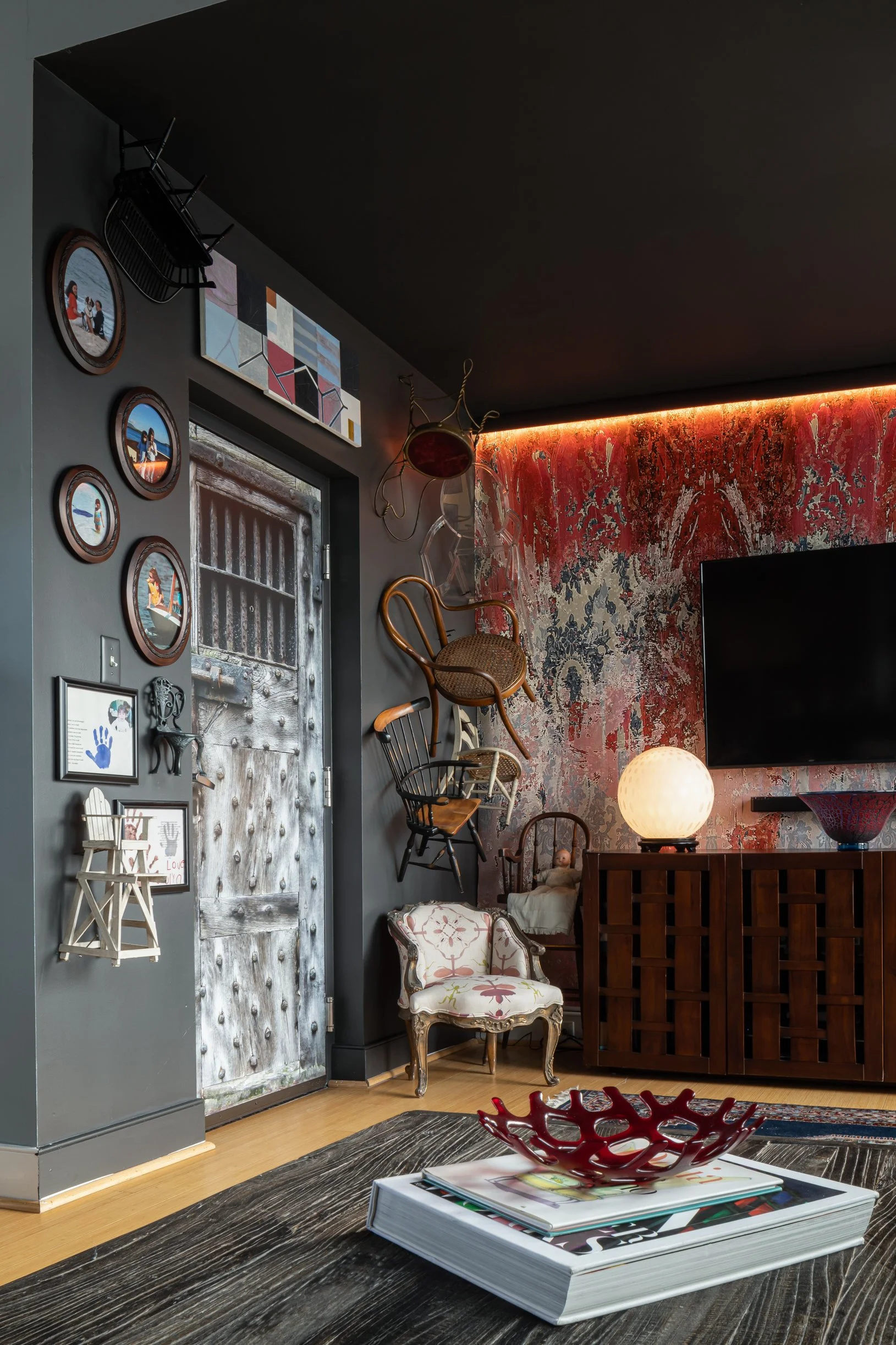
3. Deep Mulberry
Deep Mulberry by Benjamin Moore has a captivating intensity that draws attention and creates a strong visual impact. It possesses a regal quality, often associated with luxury and indulgence. We used it in our studio entry to evoke feelings of mystery and intrigue.
4. Blue SeaFoam


This shade of turquoise combines the coolness of blue with the invigorating energy of green, resulting in a color that evokes images of crystal-clear waters and tropical escapes. It was inspired by a hotel our client said made her happy! Blue Seafoam by Benjamin Moore was the perfect choice to make her home office feel reminiscent of a sunny day by the ocean.
5. Deer Path


This pale camel color instills a subtle yet inviting ambiance, offering a respite from the hustle and bustle of everyday life. Deer Path by Benjamin Moore was perfect for our client’s mudroom entrance. The neutral and warm qualities allow it to seamlessly blend with various design styles and color palettes.
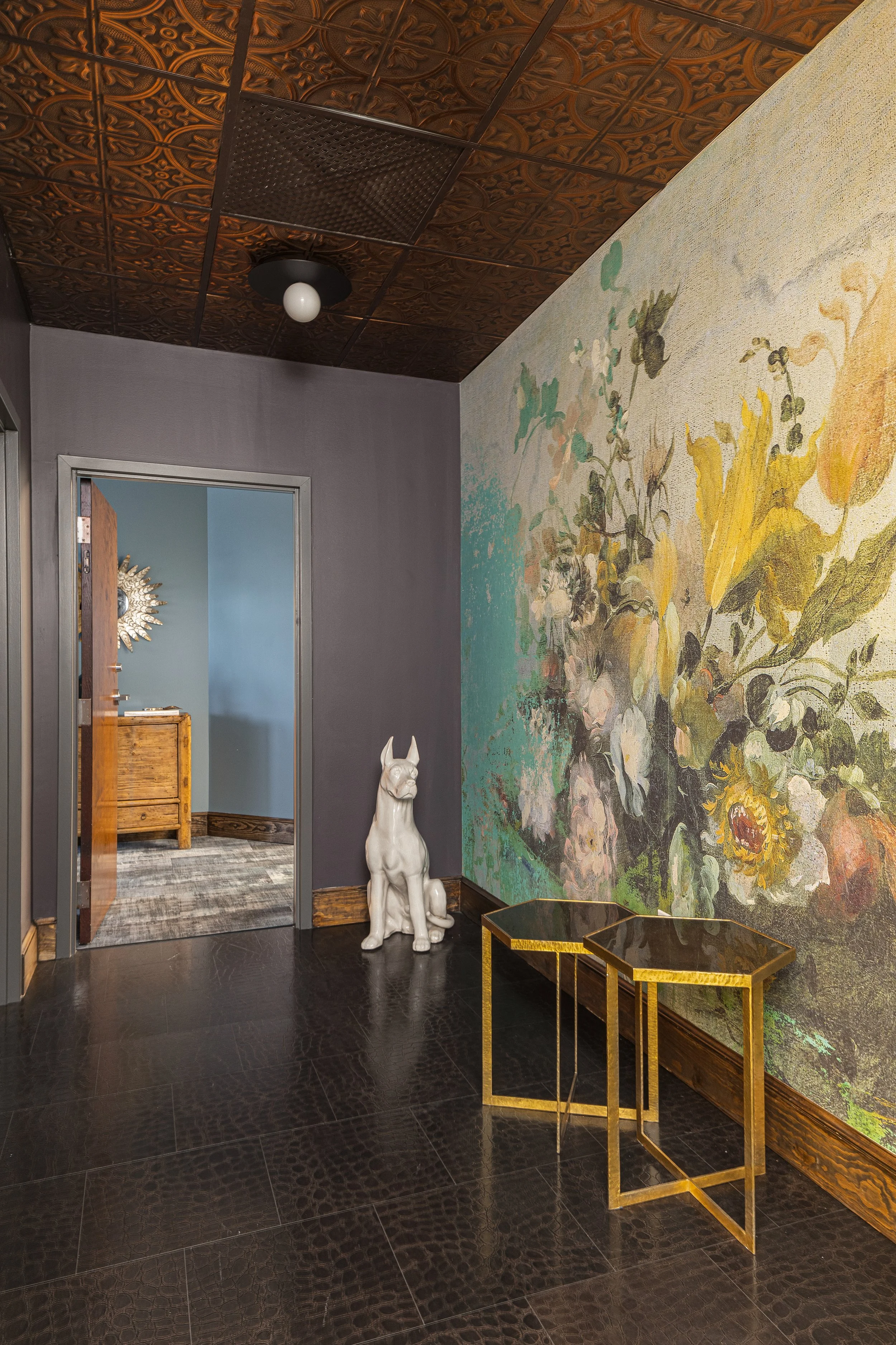
6. Pearl River

Pearl River by Benjamin Moore is a shade of white with a hint of purple in it. We used it on the ceiling to embody the gentle and dreamy qualities of twilight, evoking a sense of relaxation and harmony.
7. Revel Blue

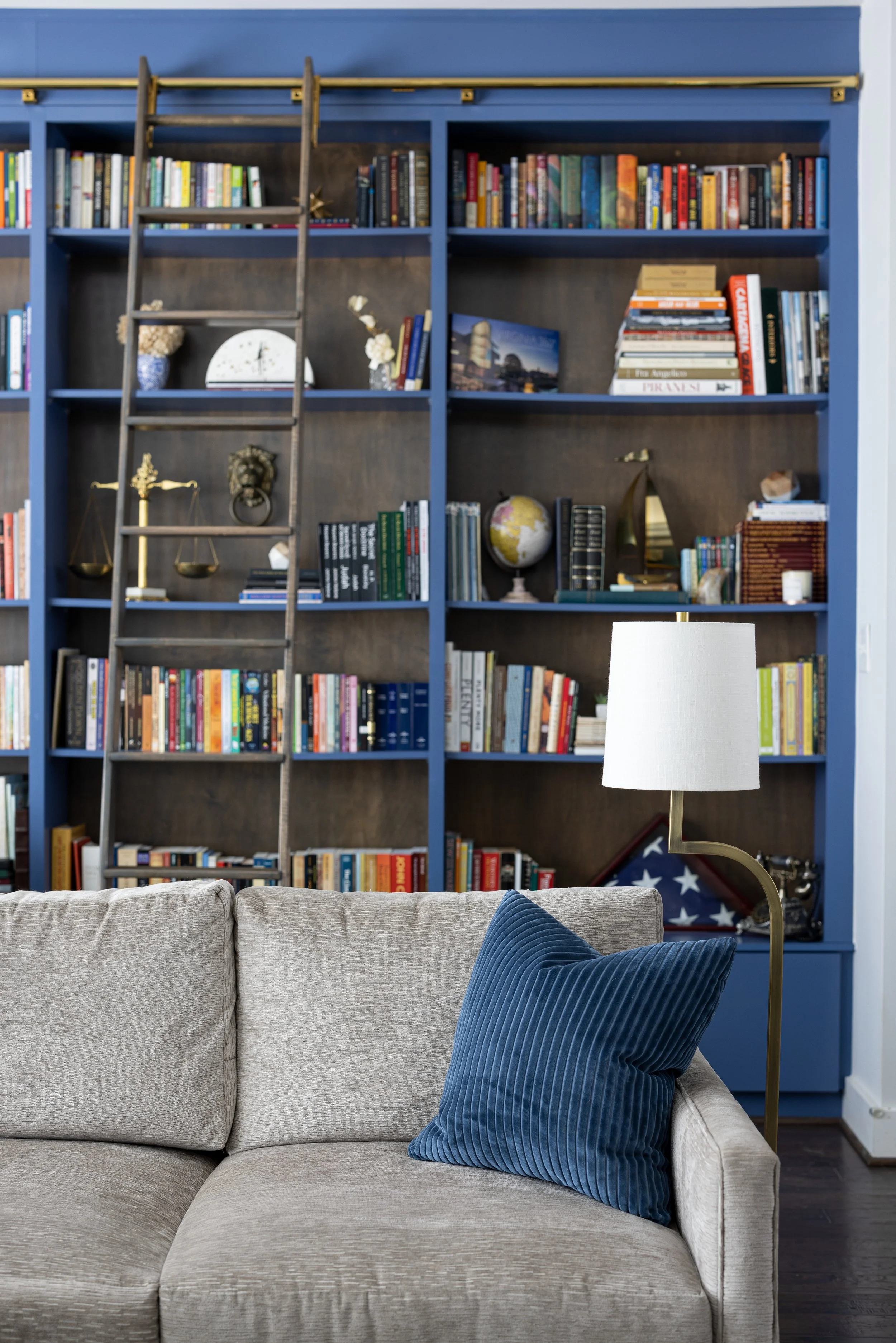
The deep and captivating nature of Revel Blue by Sherwin-Williams complements the warmth and opulence of the dark stained wood, while the brass hardware adds a touch of timeless elegance. Together, they create a harmonious synergy that elevates the overall design, infusing the room with a sense of boldness, depth and enduring style.
8. Niebla Azul


This blue-grey color, Niebla Azul by Sherwin-Williams is a captivating blend of serene blue tones with subtle hints of grey. The unique combination creates a sophisticated and calming effect, reminiscent of misty seascapes and cloudy skies. It was inspired by our client’s art.
9. Beach Glass


Envision a tranquil coastal scene where the gentle waves meet the hazy horizon. That is Beach Glass by Benjamin Moore. This blue-green-grey hue strikes a delicate balance between coolness and warmth, making it a versatile choice for various interior design styles. We thought it perfect for this design mix of modern and traditional.
10. Worldly Gray


A warm gray color can be used effectively to create a grounded and organic atmosphere in your space. Worldly Gray by Sherwin-Williams provides an earthy essence perfect for layering in pattern and texture.
Have you been trying to find the perfect paint color for a room or for your entire home? Our team of experts can help. Contact us today.